work
☽❍☾
work ☽❍☾
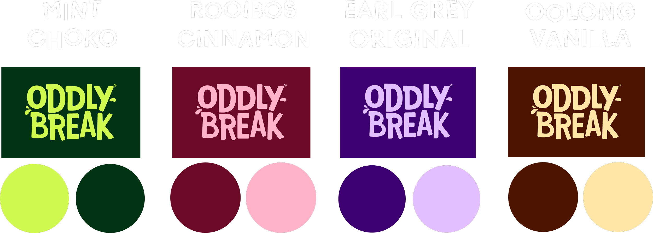
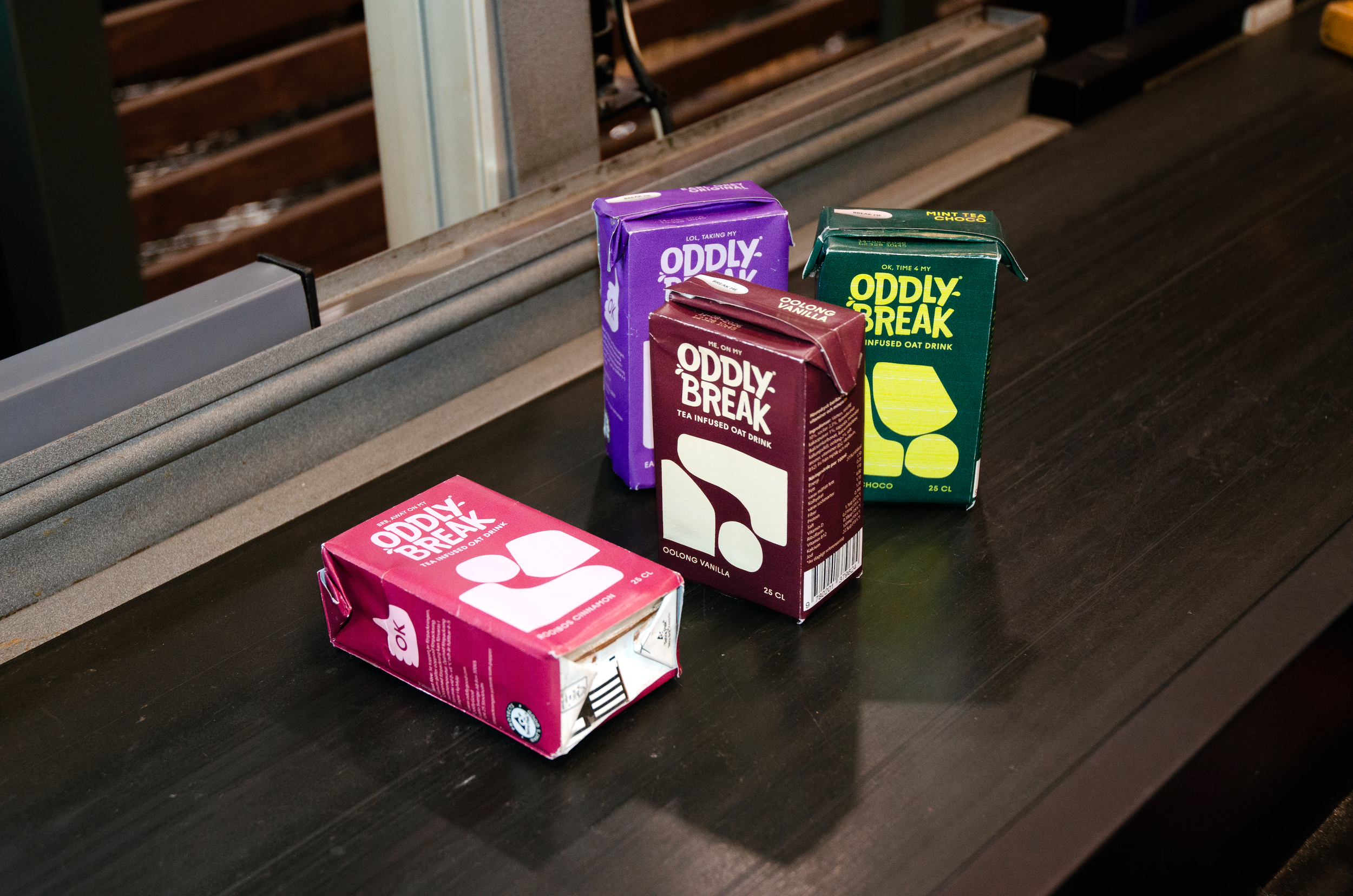
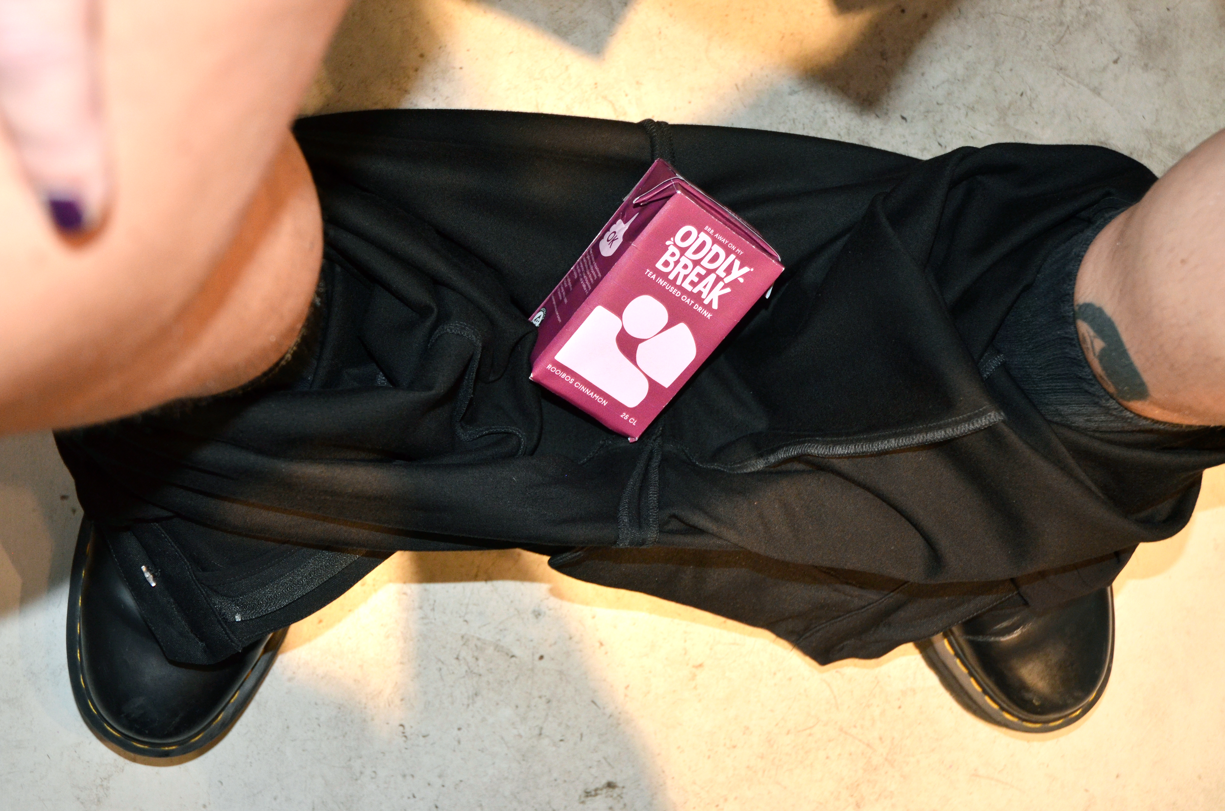
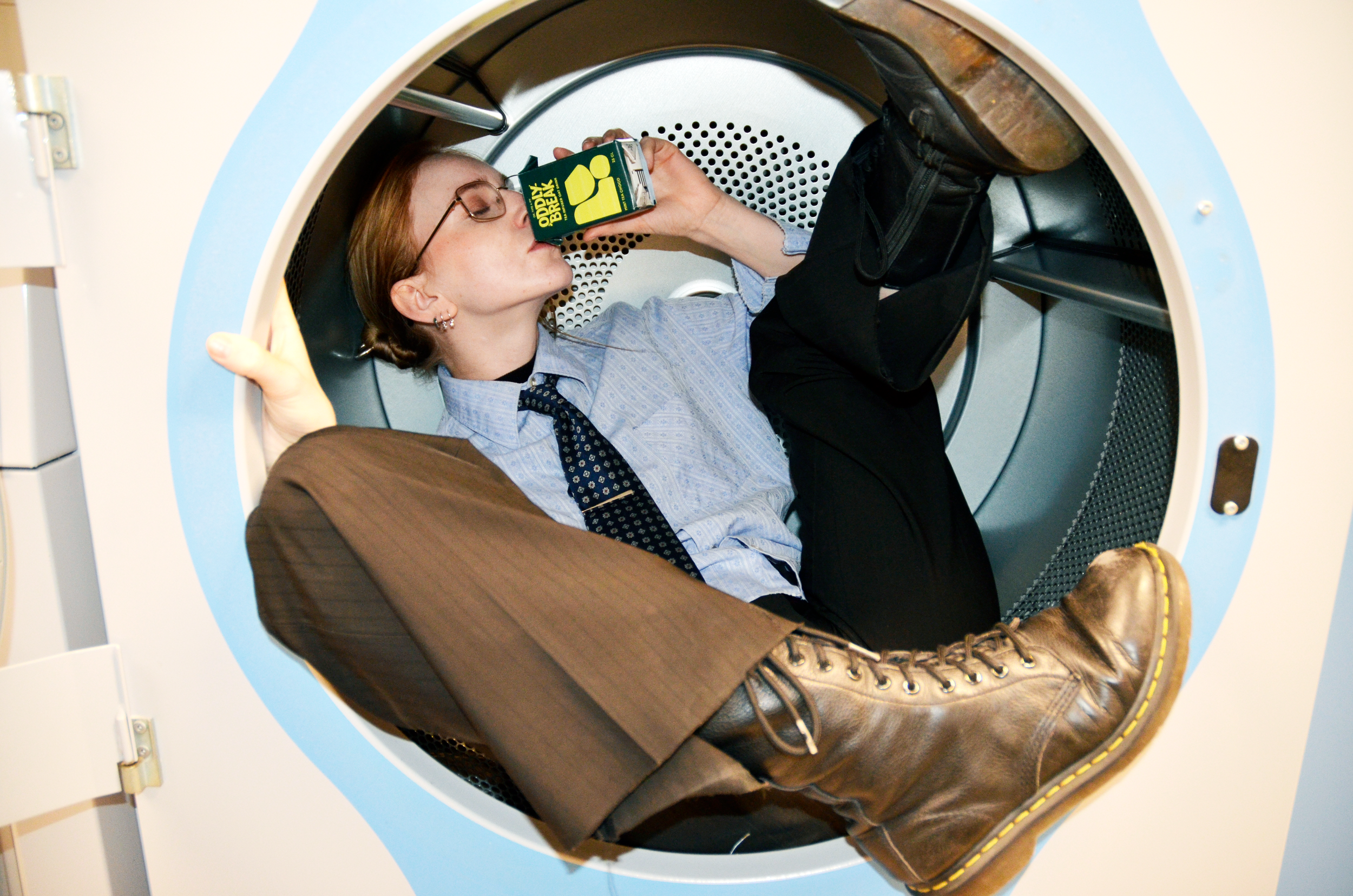
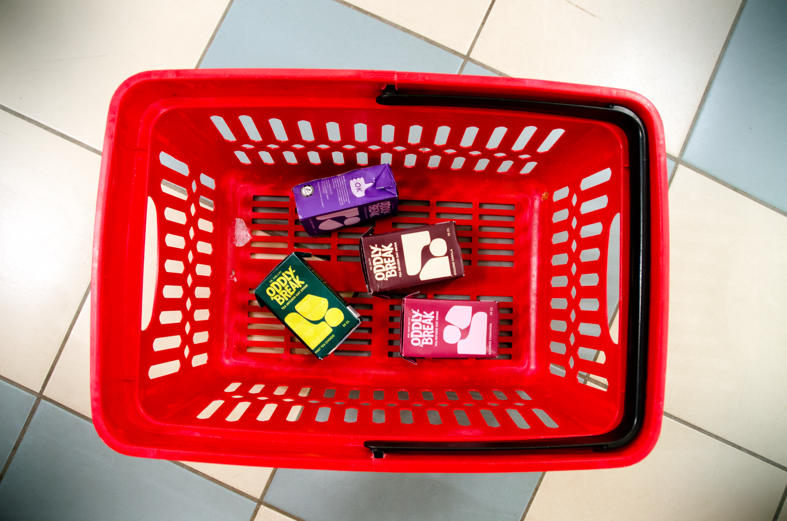
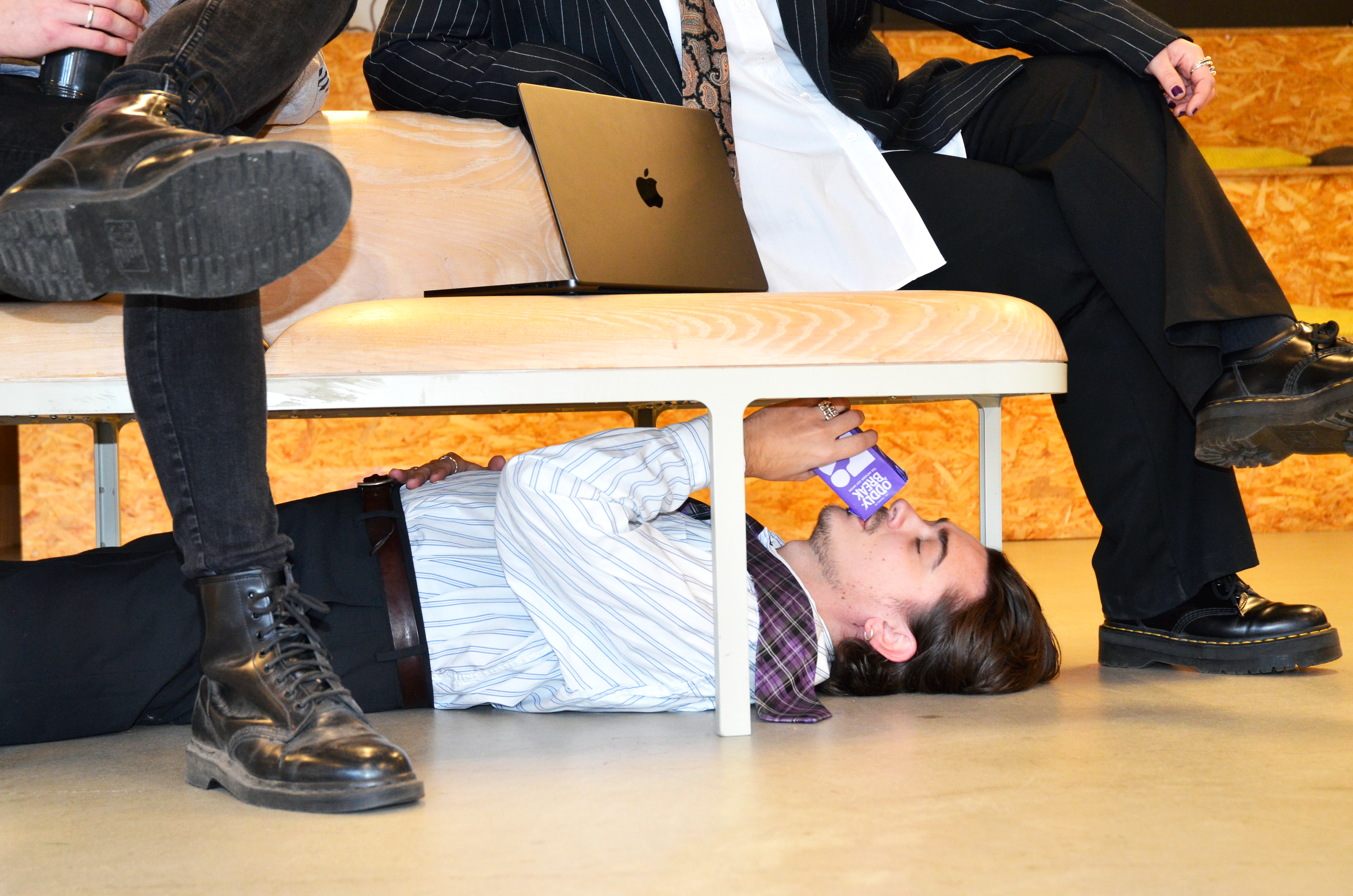
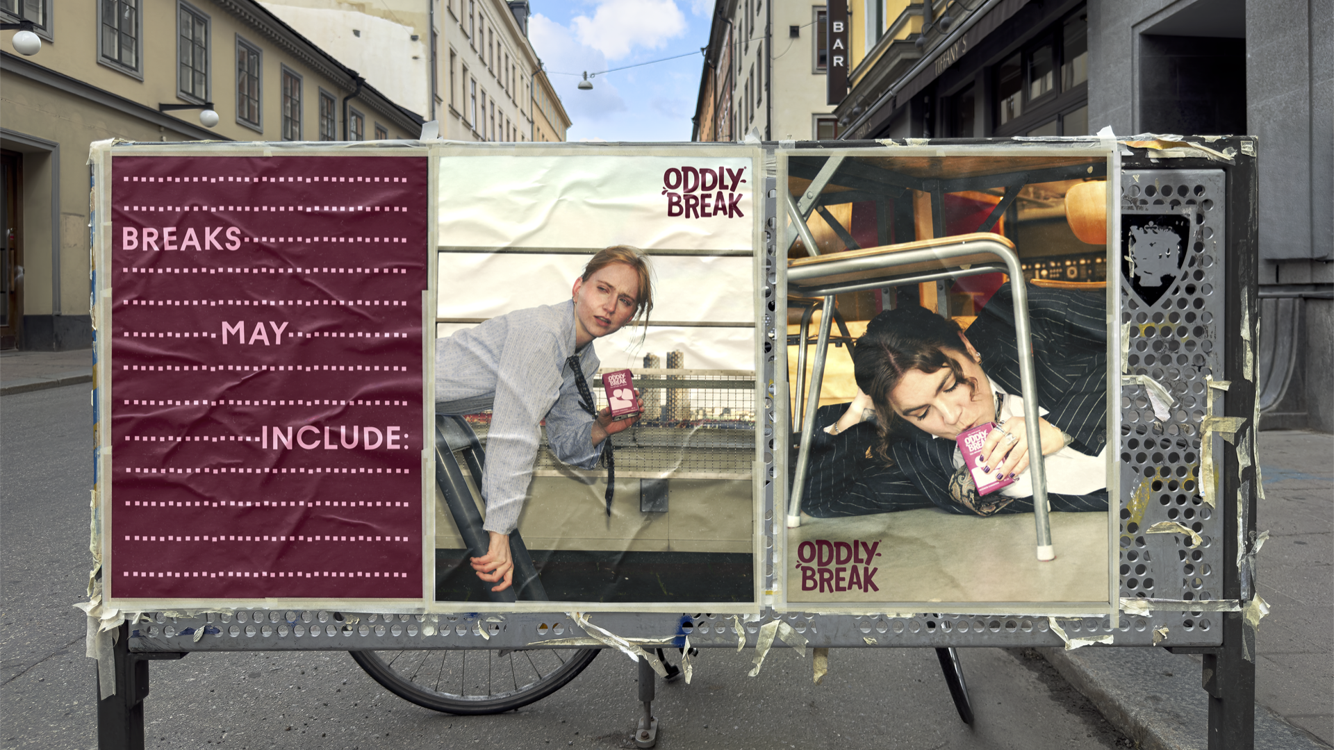
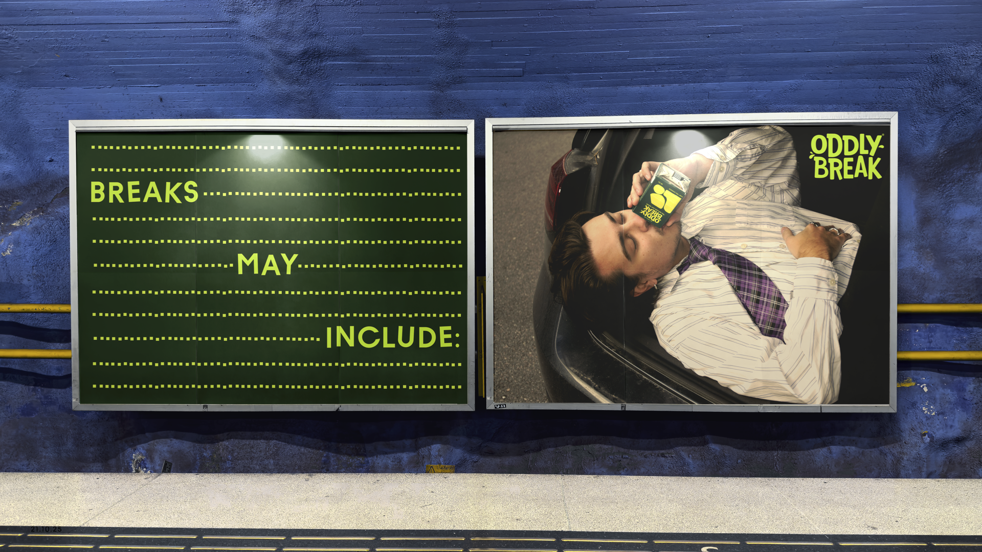
OddlyBreak
Brand Packaging Course, 2025
Strategy, Concept, Art Direction, Copy writing & Graphic design: Katarina Delin, Vega Gullberg, William Rundström & Marcus Bengtsson.
Develop an OddlyGood packaging concept for the future of plant-based wellbeing, with Gen Z as target group.
The goal is to create solutions that feel authentic to Oddlygood as well as inspiring for a new generation.
THE BRIEF
Gen Z is starting to grow tired of “the grind” – the glorification of constant work and stress in the pursuit of climbing the career ladder. This shift reflects a growing preference among young people to prioritize work/life balance and a “soft life” over relentless achievement.
Where previous generations viewed breaks as a reward after hard work, Gen Z sees them as a necessary way to exist in an overwhelming world – something you do for your own wellbeing. As a result, Gen Z is seeking a way out of a system that demands too much and leaves too little time for joy and relaxation.
INSIGHT
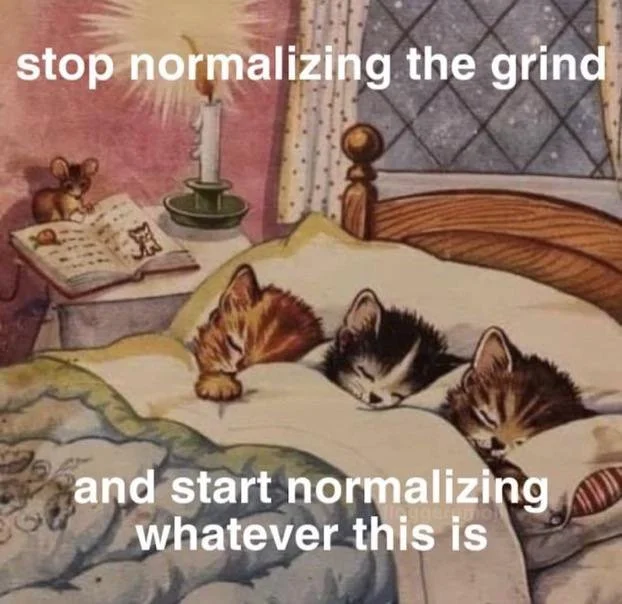
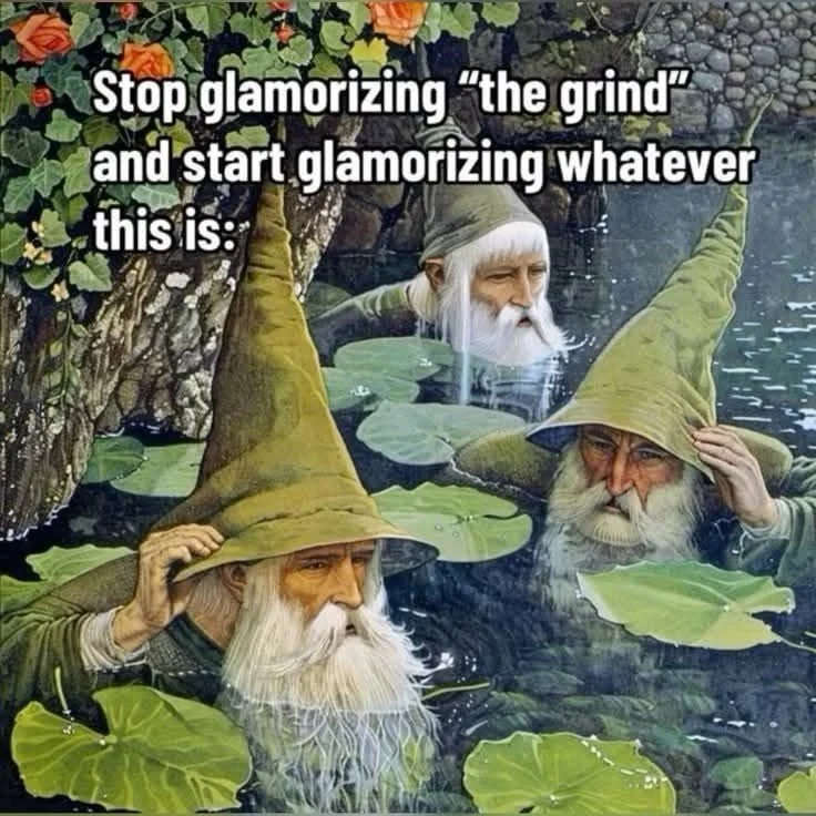
ODDLYBREAK serves as a protest against the glorification of “the grind,” employing humor and self-irony as mechanisms for coping. Our tone of voice is inspired by the meme culture, a space heavily frequented by Gen Z.
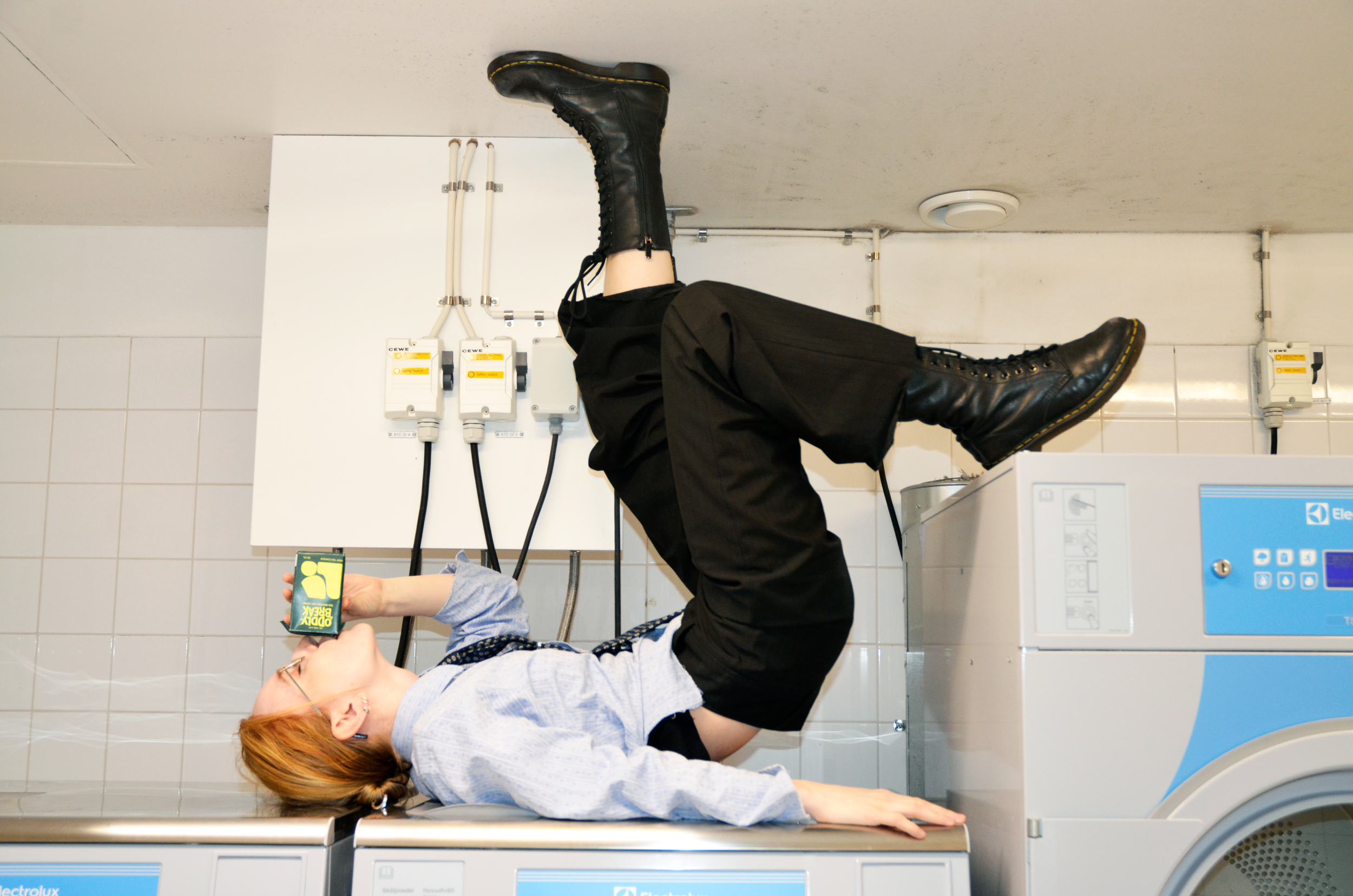
With ODDLYBREAK, Gen Z can reclaim the notion of taking a break on their own terms. It is not a wellness ritual, mindfulness practice, or a “self-care Sunday.” It is simply a moment where you don’t have to excel or perform.
A break is not a reward — it is essential.
THE CONCEPT: ODDLYBREAK
☽❍☾
☽❍☾
☽❍☾ ☽❍☾


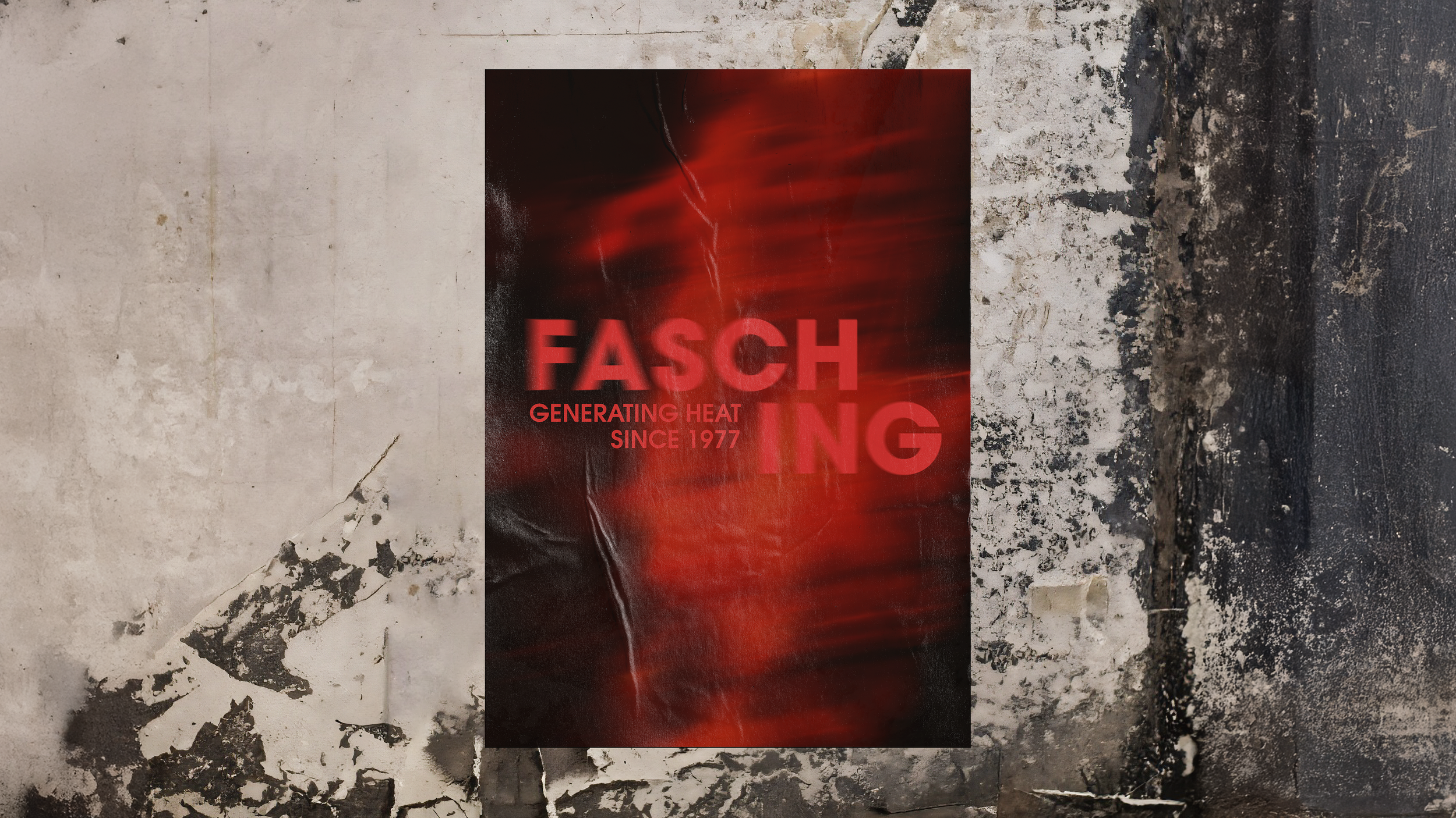
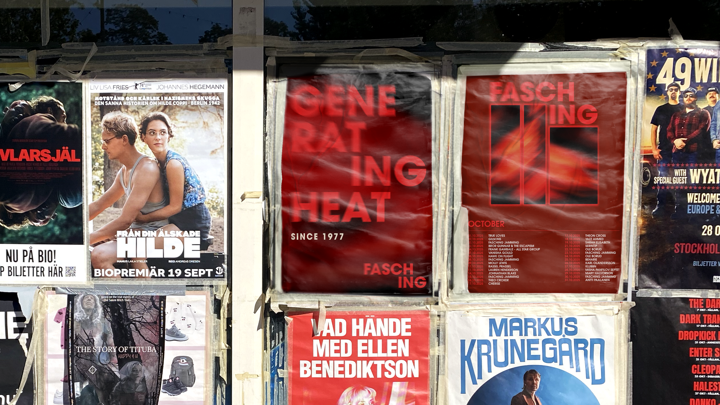
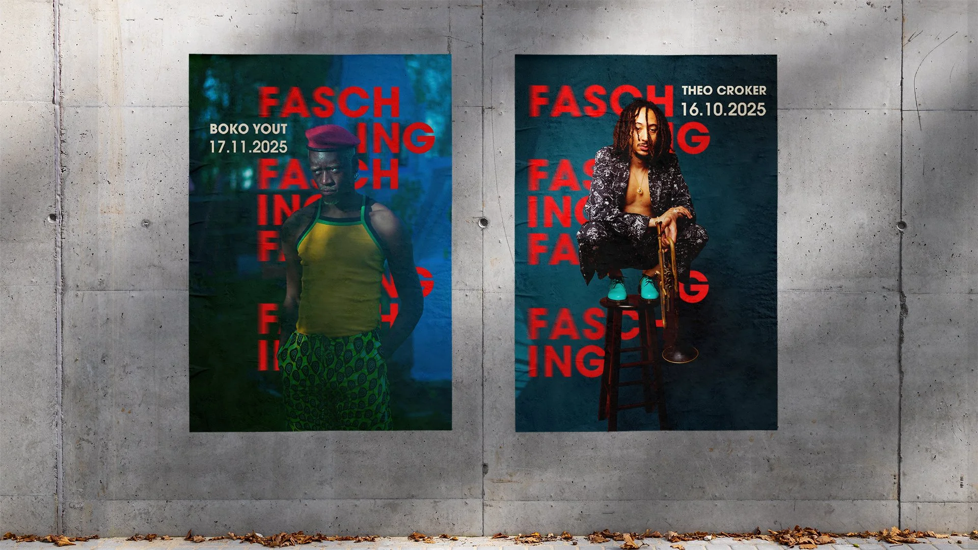
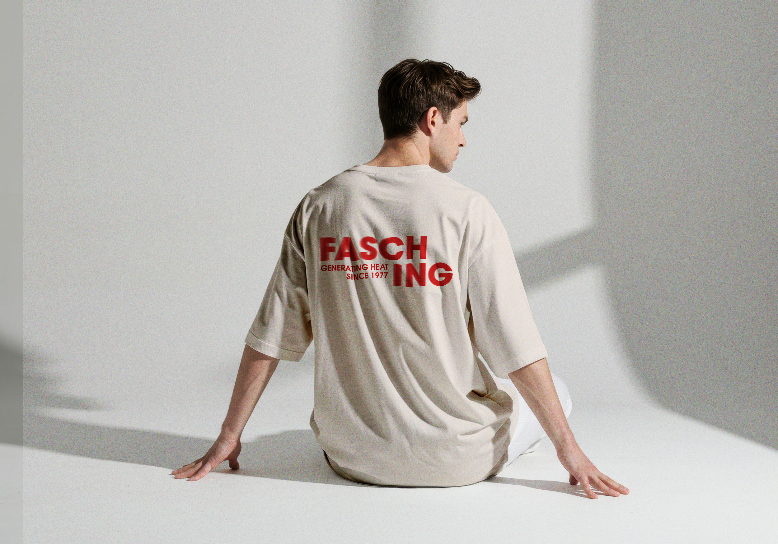
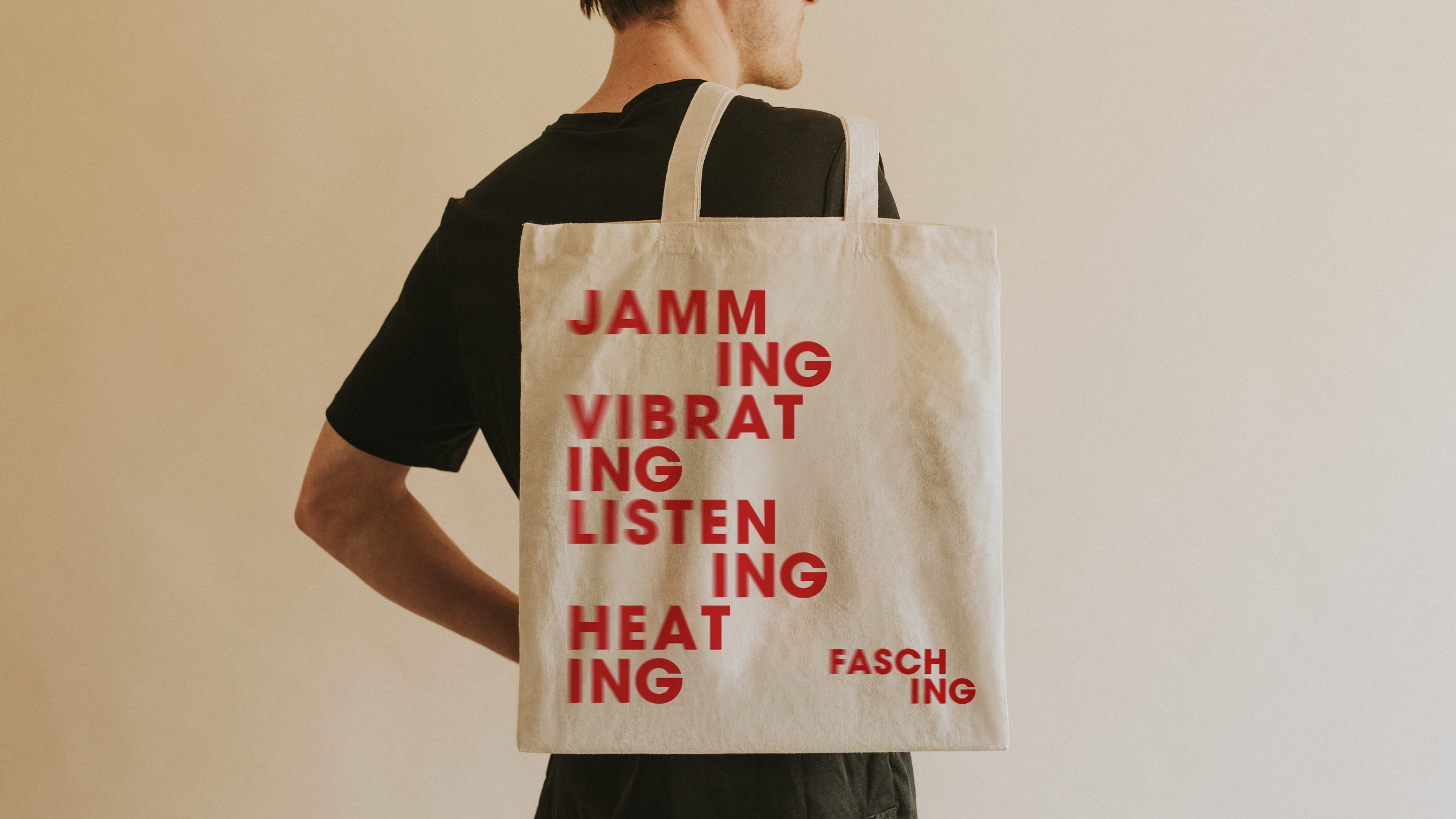
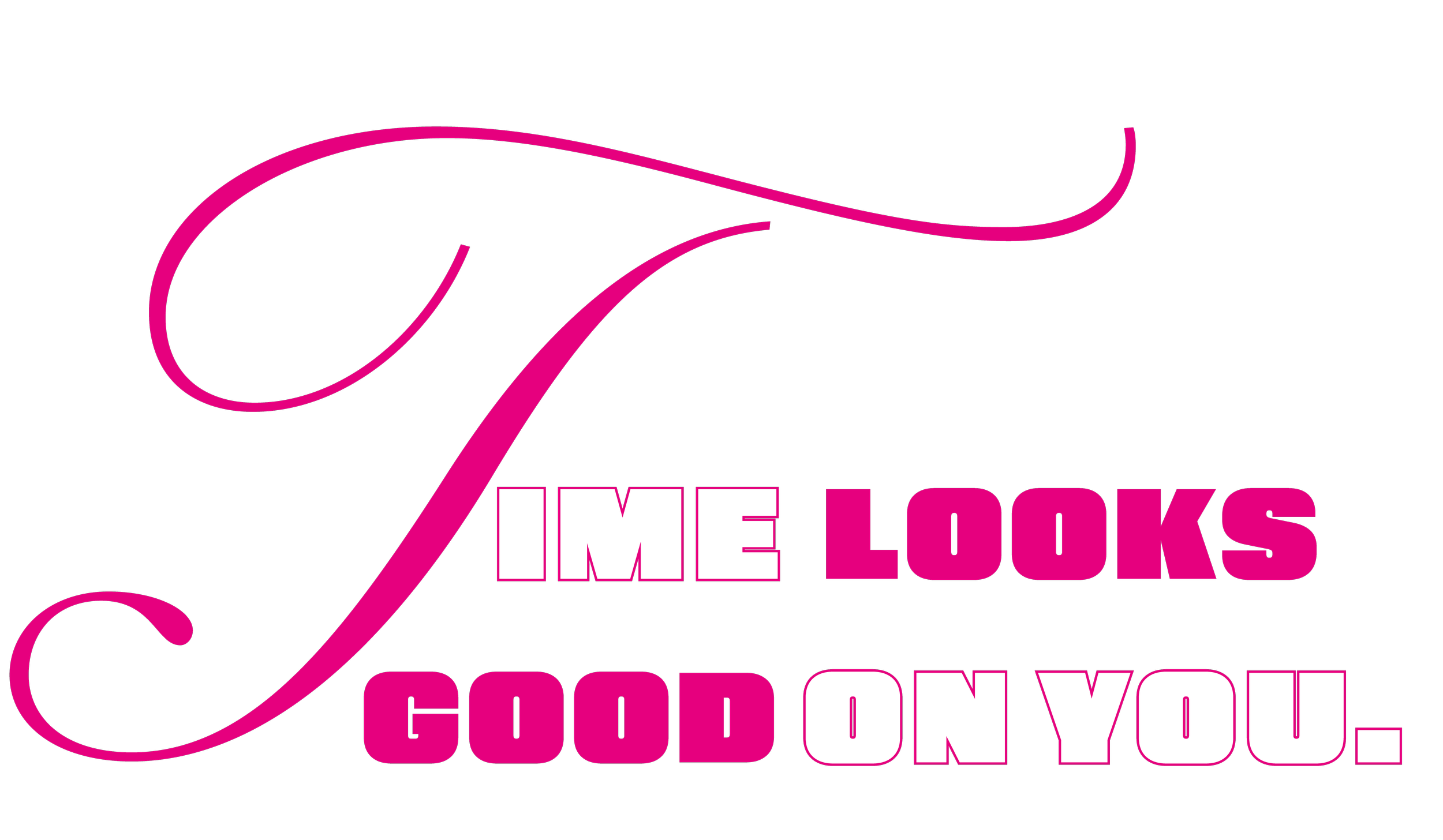
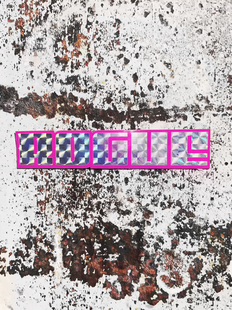
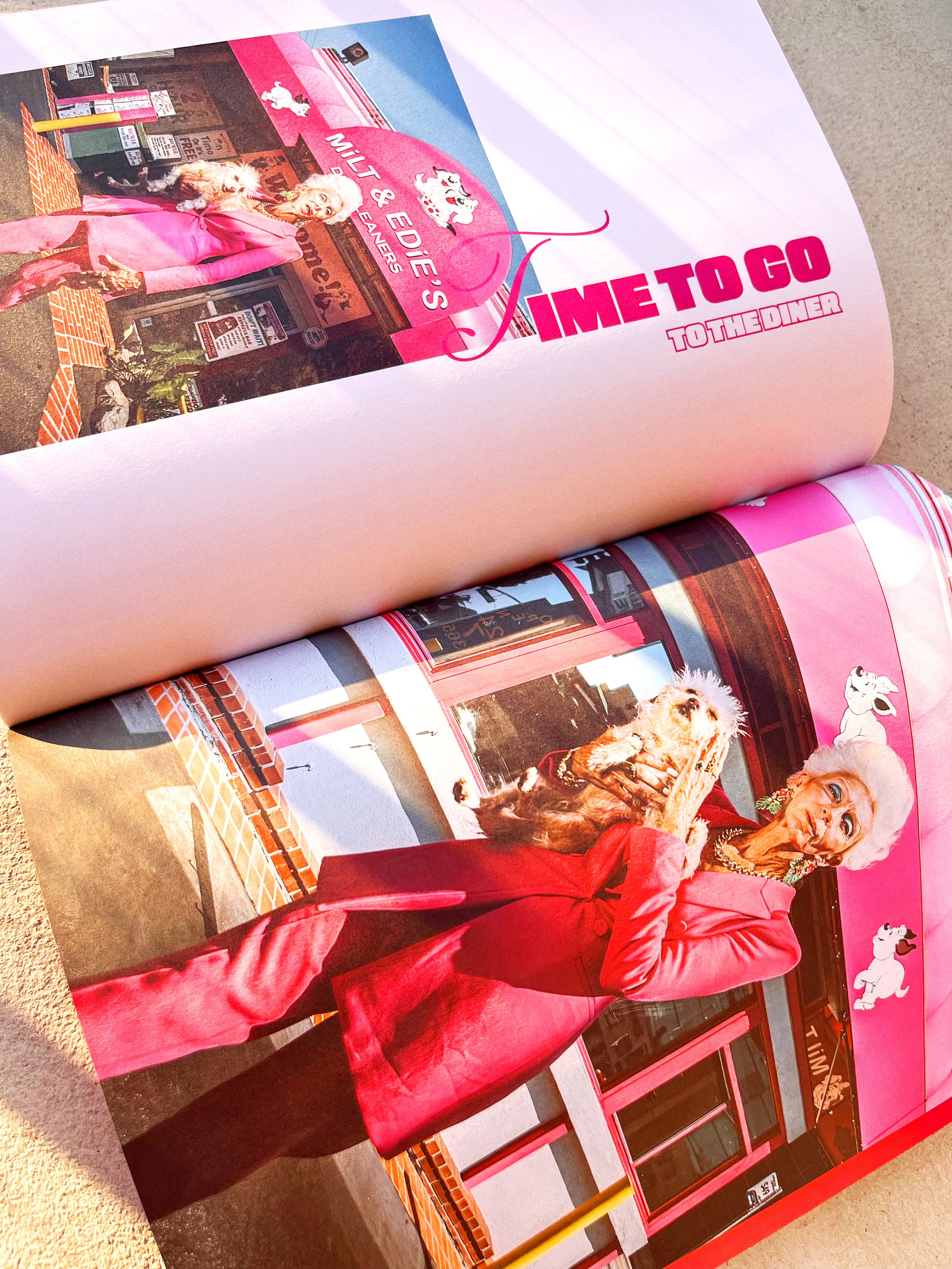
Fasching
Communication Design 3 Course, 2025
Strategy, Concept, Art Direction, Copy writing & Graphic design: Katarina Delin, Emma Nilsson & Emil Karlsson.
THE BRIEF
Create a new visual identity for Fasching that strengthens the brand and its communication.
The new identity should reach a broader and younger audience, increase the share of returning visitors, enhance awareness of Fasching as a brand and build loyalty through membership and community.
Fasching wants its visitors to become the venue you follow, not just the artist you happen to like.
THE CONCEPT: GENERATING HEAT
Introducing a nisched and cocky, yet still dynamic and inviting Fasching.
We aspired to make a new and fresh visual identity that reflected the warmth and pulse of Fasching’s inspiring and creative community, while still maintaining their astonishing legacy and what they stand for.
The word ‘friction’ quickly became prominent in our visual expression. Friction arises when surfaces meet — it vibrates and moves, energy turns into heat. Blurry visual elements creating a sense of movement and rhythm. A colour palette usually connected to jazz, but put in a new costume. Blocks and letters overlapping, chafing against teacher other. And heat is generated.

The photos that started it all
Our own photos taken during a gig at Fasching inspired our graphic expression throughout the visual identity. Motion blur created by slow shutter speed illustrated the heat and the pulse vibrating from the community of Fasching.


☽❍☾
☽❍☾
☽❍☾ ☽❍☾
Rogue Magazine
We are living in a f****d up world that constantly tells us to stop aging. Over the past decade, there has been a substantial increase in beauty treatments aimed at reducing wrinkles and combating signs of aging.
Taking inspiration from the already existing magazine name Vogue, Rogue Magazine was born from a desire to challenge one of fashion’s most persistent myths; that style belongs to the young. Featuring only the older generation, wrinkles aren’t edited out; they’re celebrated!


☽❍☾
☽❍☾
☽❍☾ ☽❍☾
Editorial Design Course, 2025
Tug Of Truth
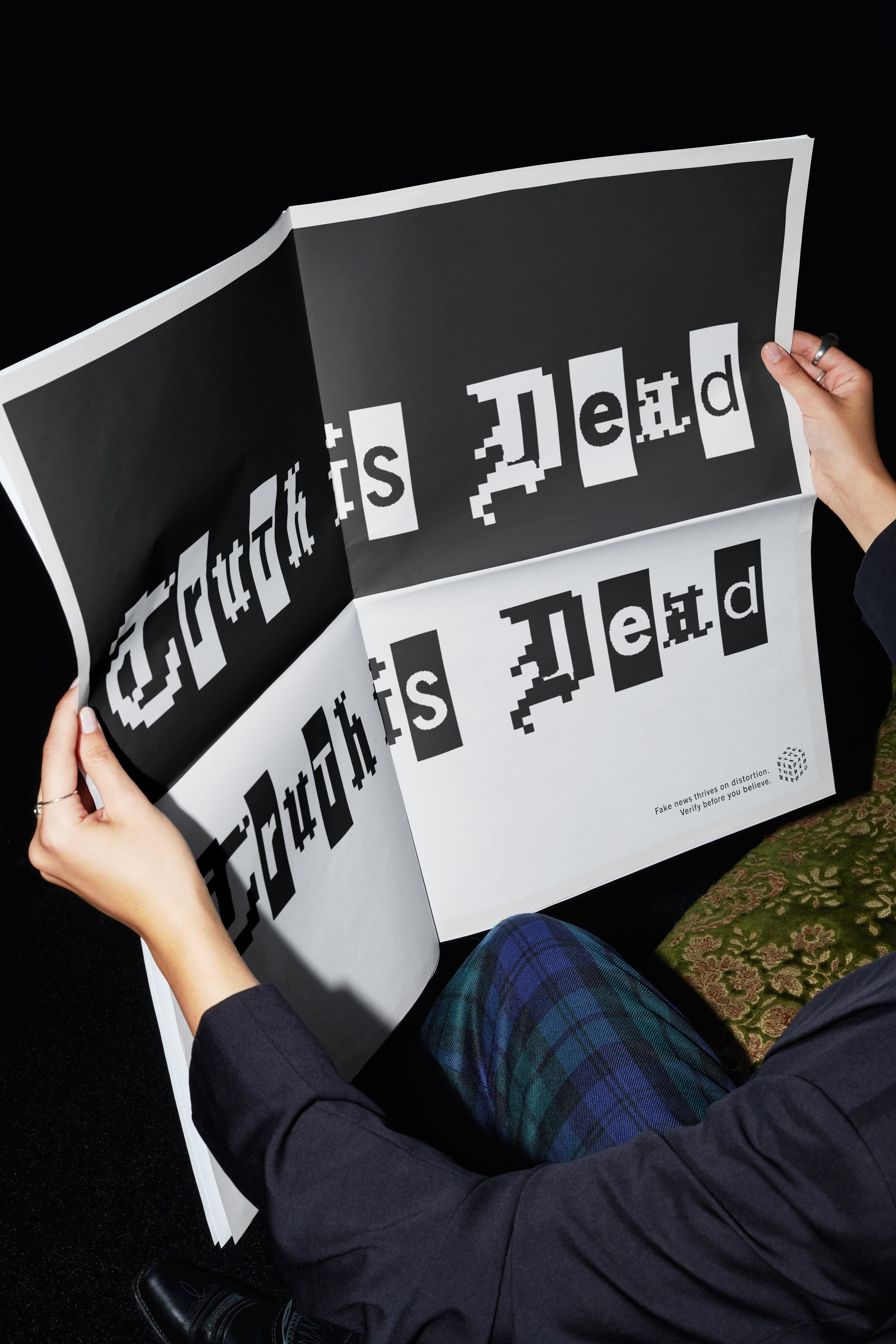
Design Challenge Course, Submission for D&AD New Blood Awards, 2025
The brief (set by Monotype in collaboration with Pentagram): Reimagine the role of typography in the tension between freedom and law & order. Choose a cause or idea that grapples with this tension and create a campaign that puts typography at the core.
Strategy, Concept, Art Direction, Copy writing & Graphic design: Katarina Delin, Alma Sköld & Elina Mannström.
PROBLEM
We live in a media-driven society with a constant flow of information, where polarization is increasing globally.
Fake news and propaganda are influencing elections and political decisions, making us question what’s true and what’s not.
SOLUTION
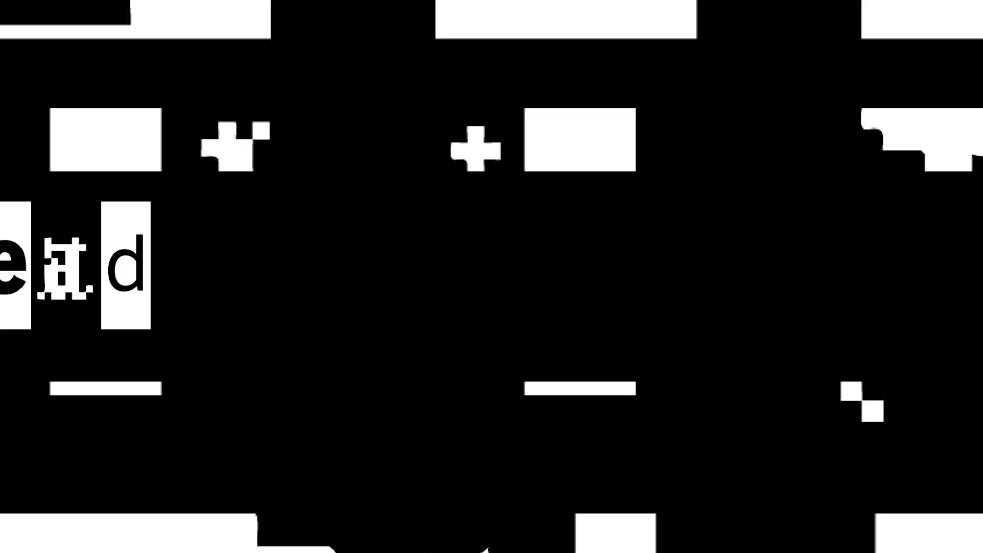
A campaign for a dynamic typographic cube that shifts and distorts, visualising the ongoing tug of truth.
Through motion, interaction and distortion, the campaign is a tool for highlighting and creating awareness on how media structures are constantly shaping our understanding.
INSIGHT
Alternative truths and fake news are a threat to our democracy.
Truth is no longer absolute, it is shaped and distorted depending on which perspective wins the tug of war.
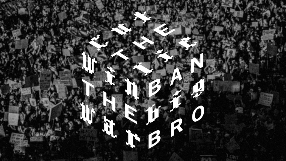

The cube symbolises how the truth can be distorted and changed depending on who’s controlling the information; a constant shifting information instrument where every turn reveals a new version of the truth.
Usually known as a symbol of logic and solutions, the cube is now a tool for manipulation, symbolising a fractured reality constantly re-arranged by those in control. It marks the beginning of a movement that puts democracy at the top of the agenda, in a world where truth is dead.
To enhance the campaign, we use provocative copy writing that makes the audience stop, question and reflect.


☽❍☾
☽❍☾
☽❍☾ ☽❍☾
Moonshine Poster


☽❍☾
☽❍☾
☽❍☾ ☽❍☾
We are li
From my own playground, 2024
Typography Poster
Designing a movie poster using only letters, taking inspiration from the history of the font Franklin Gothic.


☽❍☾
☽❍☾
☽❍☾ ☽❍☾
Typography 1 Course, 2024
Don’t fear the gloom

Graphic Production course, 2024
Printed at Åtta45 Tryckeri.


☽❍☾
☽❍☾
☽❍☾ ☽❍☾
Motion Design

☽❍☾
☽❍☾
☽❍☾ ☽❍☾
Bugotel

Creating a concept in 2050, taking inspiration from the Sustainable Development Goals.
Art Direction & Graphic Design: Katarina Delin
Production Leader: Felicia Semitjov
Strategic Communication: Emily Ehn
Copy writing: Ragnar Westberg Martinez
Public Relations: Jens Bergström
Growth Marketing: Anders Christensen


☽❍☾
☽❍☾
☽❍☾ ☽❍☾
Explore Course, 2024
Kat Knix
My music alias Kat Knix is an impatient, slightly manic perfection work ethic with a thirsty thrive for making music with a poignant and an important message. But she can’t stress enough the importance of not taking stuff too seriously. Cause life is serious enough.
Taking inspiration from artists like Peaches, Kate Bush, Honey Dijon, Beth Ditto, PJ Harvey and Charlotte Adigéry, she enjoys combining her vocals with electronic/alternative dance production along with a sprinkle of indie rock and nu disco.
In 2010 she settled in London where she spent 11 staggering years. Apart from being ignited by the ooze pouring out of the vibrant city, she was involved with musical collaborations like CRISP&CLASSY, and remixed for artists such as The Knife and Icona Pop.
Music

