Communication Design 3 course, 2025Strategy, Concept, Art Direction, Copy writing & Graphic design: Katarina Delin, Emma Nilsson & Emil Karlsson.work
☽❍☾
work ☽❍☾
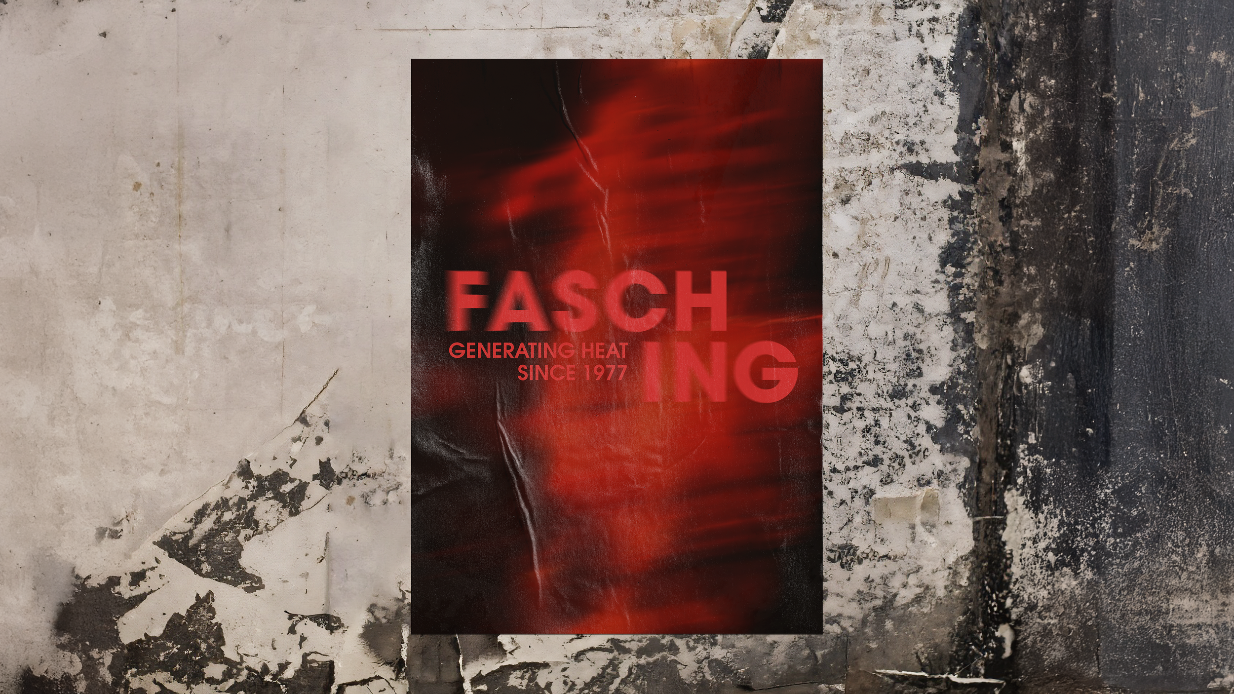
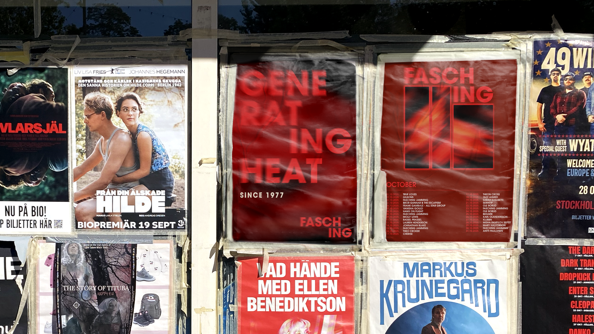
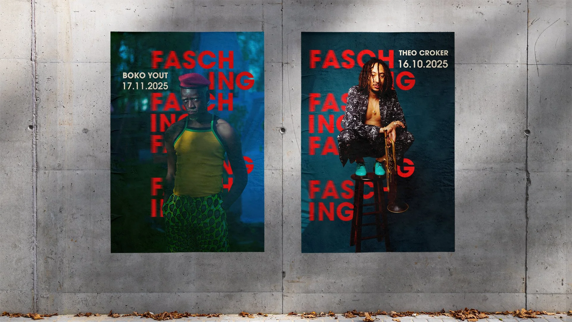
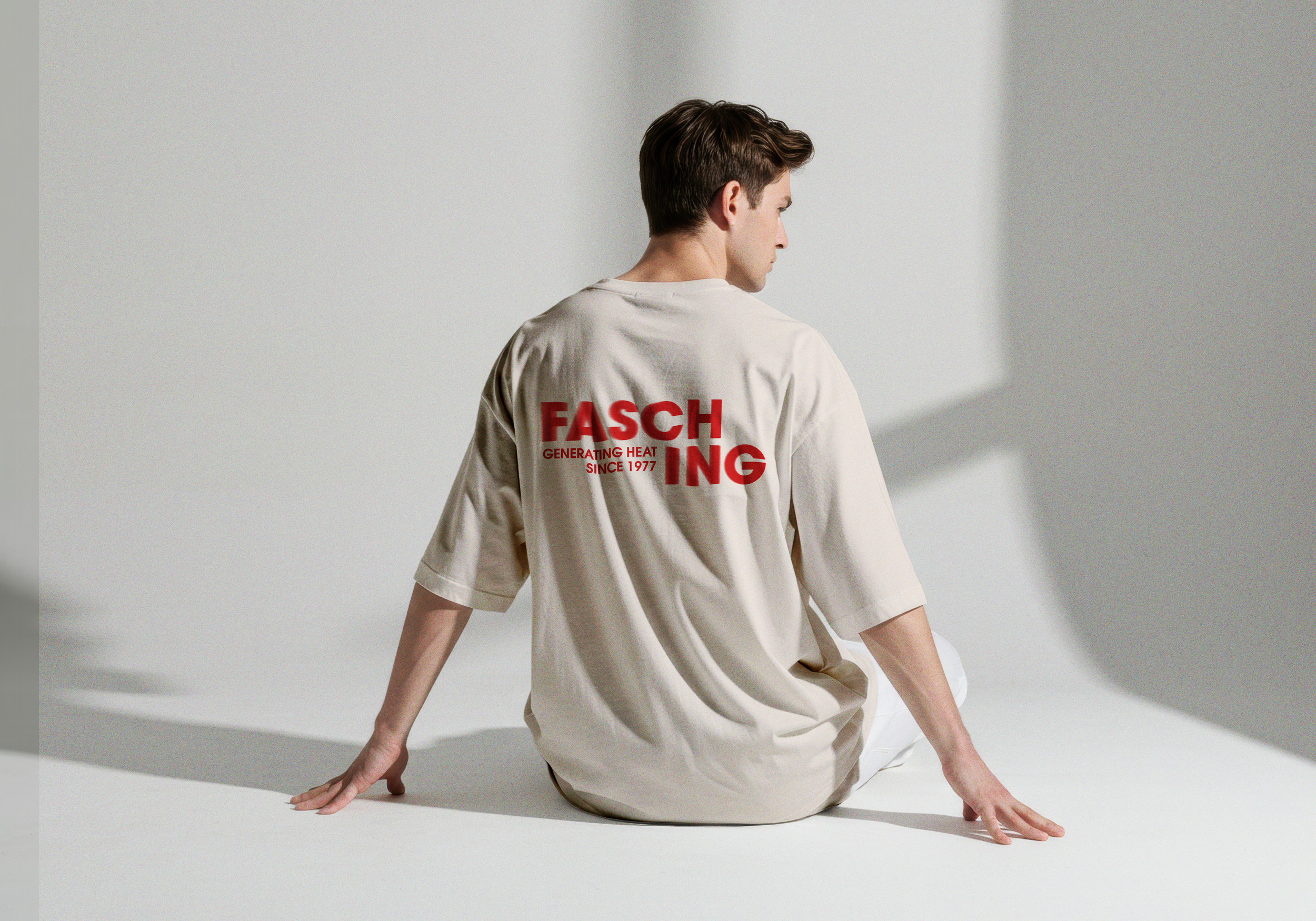
Generating Heat
THE BRIEFCreate a new visual identity for Fasching that strengthens the brand and its communication.
The new identity should reach a broader and younger audience, increase the share of returning visitors, enhance awareness of Fasching as a brand and build loyalty through membership and community.
Introducing a nisched and cocky, yet still dynamic and inviting Fasching.
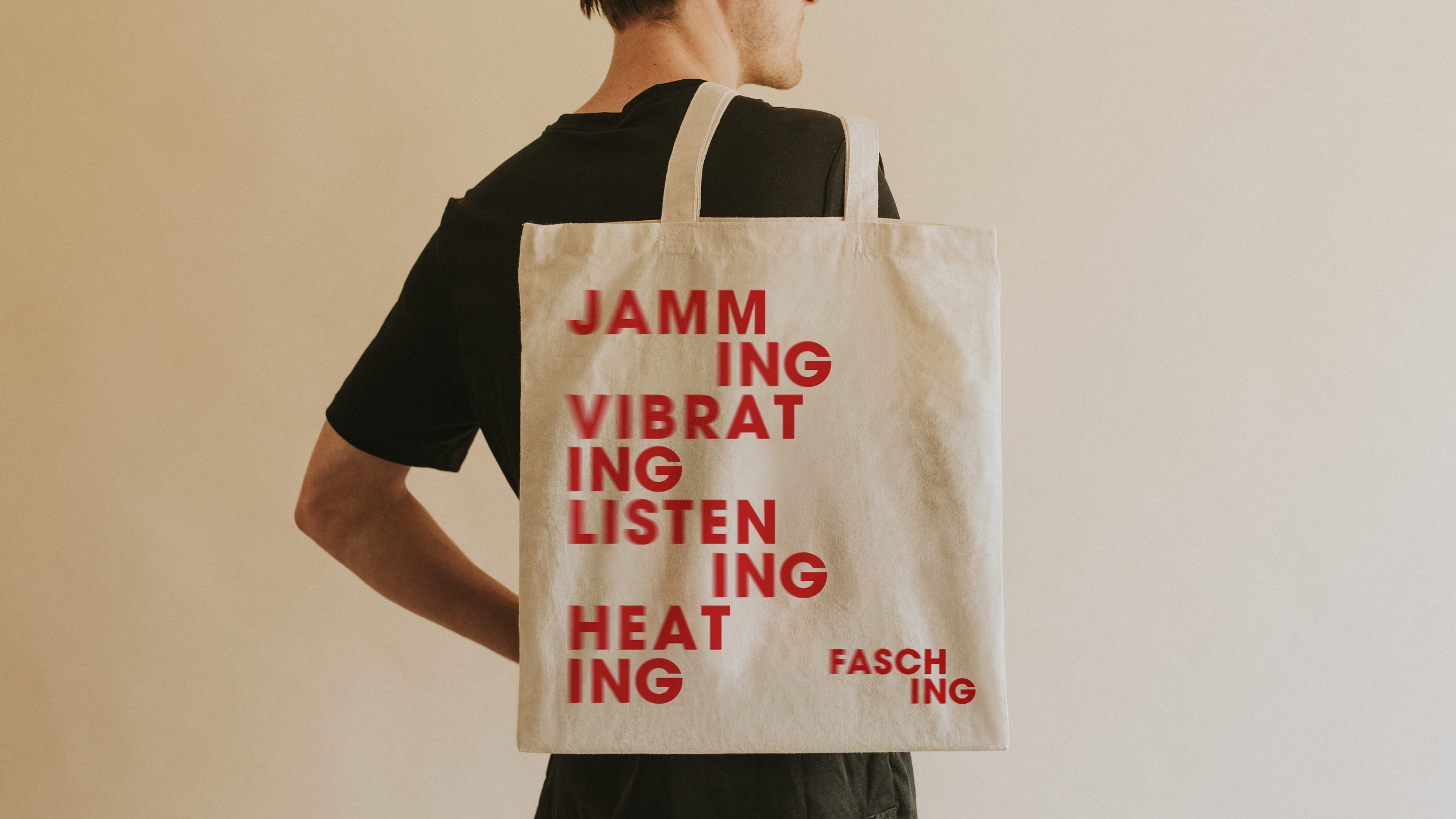
We aspired to make a new and fresh visual identity that reflected the warmth and pulse of Fasching’s inspiring and creative community, while still maintaining their astonishing legacy and what they stand for.
The word ‘friction’ quickly became prominent in our visual expression. Friction arises when surfaces meet. It vibrates and moves, energy turns into heat. Blurry visual elements creating a sense of movement and rhythm. A colour palette usually connected to jazz, but put in a new costume. Blocks and letters overlapping, chafing against teacher other. And heat is generated.THE CONCEPT